Looking back at my blog this year, I realise that I have had to put a lot more detail into my posts than in the AS year. I added a lot more technology to my blog than last year, and I think this adds depth to my research and planning and makes the blog more interesting.
I think that I could have had an even better blog, as I know that leaving things to the last minute and not blogging constantly throughout the project lowered the quality of my posts. However, I believe that my blog contains quite a lot of useful information which shows the steps I have taken to reach the final stages of my production work.
My blog could have been better if I had accounted for my research in even more detail, and the planning posts are probably not as complete as they could have been. If I could do it again, I would try to keep up to date with everything I do as I do it and not try to remember it when I finally decide to blog about it.
Showing posts with label Anca Alexe. Show all posts
Showing posts with label Anca Alexe. Show all posts
Friday, 24 January 2014

EVALUATION: Question 4
Question 4:
What have you learned from your audience feedback?
Glogster explaining how audience feedback helped me make my products better:
(Full screen works best)

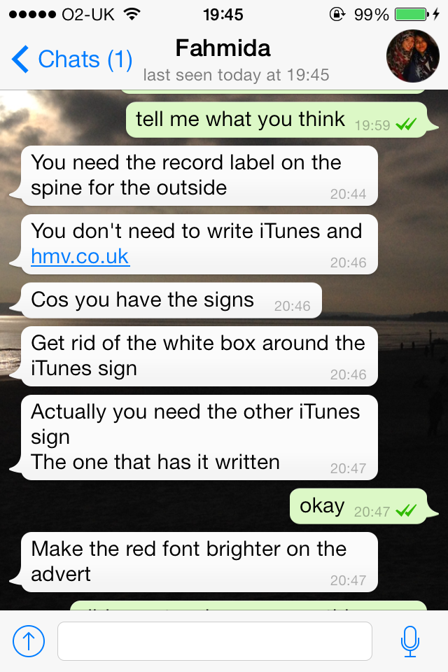
She mentioned a few things that were missing, which I hadn't added yet as these were not the finished products. However, what she said about the iTunes and HMV signs really helped, as I decided to change those elements.
She also said that I should make the red font brighter on the advertisement. However, I did not change it because it only looked dark on our phones, as the image was very small. On the computers and in print, the red font was much more clear and there was no need to change it.


What have you learned from your audience feedback?
Glogster explaining how audience feedback helped me make my products better:
(Full screen works best)
This video shows the reaction of our media class and teachers after watching our rough cut:
Audience feedback after the cinema screening:
Strengths: costumes, dancing, locations, song, cutting to the beat
Strengths: lighting, costumes, cut to the beat, performers looked energetic
Strengths: editing organised, costumes, walking at the start showed we were a group
Strengths: movement, locations, camera shots, variety
Cinema reactions
-
The reaction to our video being shown in the cinema was good, our peers
seemed excited by our video and they seemed to enjoy it - they even had
a few positive reactions during the video, which I was really happy
about. This video shows how the cinema audience (where everyone was part of our target audience) reacted to our video:
- After the screening, I asked a few people to give me some feedback -
most of the comments I got included the fact that the editing was good
and they liked that it was in time with the beat; they all mentioned the
costumes worn by the performers, in the black and white theme. Our
location also seemed to be successful, and it did not take the attention
from the performers, but still looked good.
- People also liked the way we synchronized our movements to the music
and with each other, and the shot of us walking at the start of the
video was also appreciated, as it showed that we were a group.
Ancillary Work
Mary - Teacher feedback on ancillary products
The feedback I got from my teacher Mary on my ancillary work was very good. She liked the graphics I used on the front cover and the fonts, and the fact that I used them in all of the products.
I included all the needed information and my performers are in the spotlight on the cover. I also followed the conventions and made the album name smaller than the artist name.
One thing that Mary noticed was that everything on the advertisement was written in capital letters - this is because the font I used, Trajan Pro, had only capital letters - using the caps lock would only change the letters by making them a little bit bigger - like the difference in the name 'CandiHearts', where the C and the H are in caps lock with this font.
I have had some feedback on my ancillary work as I was getting close to finishing the digipak and advertisement. I asked my friend to give me her opinion on the social media app Whatsapp, and this helped me make some improvements:
She mentioned a few things that were missing, which I hadn't added yet as these were not the finished products. However, what she said about the iTunes and HMV signs really helped, as I decided to change those elements.
She also said that I should make the red font brighter on the advertisement. However, I did not change it because it only looked dark on our phones, as the image was very small. On the computers and in print, the red font was much more clear and there was no need to change it.
After I finished my ancillary work, I asked the same person to give me feedback on it.
I was very pleased with this feedback - I was sure that the costumes were very important to link this print work to my music video, as all the audience feedback I got before mentioned the use of our black and white costumes.
Monday, 20 January 2014
EVALUATION: Question 3
Question 3:
How did you use media technologies in the construction and research, planning and evaluation stages?
RESEARCH
In the research stages, I used a few different websites to find useful information about music videos, such as YouTube, Vimeo, Soundcloud, artists' web pages and their social media profiles (Facebook, Twitter, Instagram).
YouTube was very useful as I could find a lot of examples of music videos which could inspire me and help me make a decision about what genre of music I'd like to make a video with.
After my group decided to do a girl group music video, we looked at as many videos of this genre as we could in order to get ideas for what we could do. However, we decided not to create our own music video for a song that already has a video, as that existing video could have influenced our ideas too much and we could have ended up with a copy of what was already produced.
We decided to choose a song by the Sugababes and we found that 'It Ain't Easy' was a good choice, as it had a nice beat and its lyrics allowed for our own interpretation.
Watching videos on YouTube and Vimeo helped us understand our genre better and see what kinds of costumes and camera shots are conventionally used in music videos of girl groups.
I also used the web to do research into Carol Vernallis, Laura Mulvey and Andrew Goodwin's theories, about which I found information on different websites and put it together in presentations, which I then put on Blogger.
I presented my research in various ways. I used Prezi, PowerPoint (which I uploaded through SlideShare), slideshows using Flickr, Animoto, and I made gifs which showed different pictures or short parts of videos.
I also discovered a Blogger app on the App Store on my iPhone, which I found very helpful for some of my posts, although it has fewer features than using Blogger on a computer.
I also used many of these for the research I've done for my ancillary work - after doing Google Image searches for existing digipaks, album covers and advertisements by girl groups.


I used the Wordle app to present lists of keywords or concepts in a more interesting way, instead of just listing them in a text post.
PLANNING:
MUSIC VIDEO PLANNING:
We prepared a pitch to present to our teachers, where we included all the aspects of planning, from costumes to risk assessments - we presented this with a Prezi:
During our Pitch we also showed our animatic (made by Anthony, a member of my group), made from hand-drawn pictures put in a slideshow with the song in the background:
ANCILLARY PLANNING
I looked through the fonts that were already installed on the Macs and found one that I could use for the artist name and other parts of the text on my ancillary work (Trajan Pro).
However, I did not like any of the others to use together with the one I had already chosen. Therefore, I decided to find one online, and I looked around the website dafont.
I found a nice font called 'Today People' which I thought looked really good and, most importantly, it looked good next to my other font.

PRODUCTION
How did you use media technologies in the construction and research, planning and evaluation stages?
RESEARCH
In the research stages, I used a few different websites to find useful information about music videos, such as YouTube, Vimeo, Soundcloud, artists' web pages and their social media profiles (Facebook, Twitter, Instagram).
 |
| Twitter - Sugababes |
 |
| Twitter - Little Mix |
 |
| Facebook - Little Mix |
YouTube was very useful as I could find a lot of examples of music videos which could inspire me and help me make a decision about what genre of music I'd like to make a video with.
After my group decided to do a girl group music video, we looked at as many videos of this genre as we could in order to get ideas for what we could do. However, we decided not to create our own music video for a song that already has a video, as that existing video could have influenced our ideas too much and we could have ended up with a copy of what was already produced.
We decided to choose a song by the Sugababes and we found that 'It Ain't Easy' was a good choice, as it had a nice beat and its lyrics allowed for our own interpretation.
 |
| Sugababes - Denial on Vimeo |
 |
| Sugababes - It Ain't Easy on YouTube |
Watching videos on YouTube and Vimeo helped us understand our genre better and see what kinds of costumes and camera shots are conventionally used in music videos of girl groups.
I also used the web to do research into Carol Vernallis, Laura Mulvey and Andrew Goodwin's theories, about which I found information on different websites and put it together in presentations, which I then put on Blogger.
I presented my research in various ways. I used Prezi, PowerPoint (which I uploaded through SlideShare), slideshows using Flickr, Animoto, and I made gifs which showed different pictures or short parts of videos.
 |
| Using Prezi - music video research |
I also discovered a Blogger app on the App Store on my iPhone, which I found very helpful for some of my posts, although it has fewer features than using Blogger on a computer.
 |
| Blogger app on iPhone |
 |
| Using pictures to present Research for music video |
 |
| Use of videos and gifs to present research for music video |
I used the Wordle app to present lists of keywords or concepts in a more interesting way, instead of just listing them in a text post.
 |
| Using Wordle to present research and planning for ancillary work |
PLANNING:
MUSIC VIDEO PLANNING:
We prepared a pitch to present to our teachers, where we included all the aspects of planning, from costumes to risk assessments - we presented this with a Prezi:
During our Pitch we also showed our animatic (made by Anthony, a member of my group), made from hand-drawn pictures put in a slideshow with the song in the background:
ANCILLARY PLANNING
I looked through the fonts that were already installed on the Macs and found one that I could use for the artist name and other parts of the text on my ancillary work (Trajan Pro).
 |
| Trajan Pro font |
However, I did not like any of the others to use together with the one I had already chosen. Therefore, I decided to find one online, and I looked around the website dafont.
I found a nice font called 'Today People' which I thought looked really good and, most importantly, it looked good next to my other font.
PRODUCTION
Use of Technology in the production for the Music Video
Use of Technology in the production of the Ancillary Work
I used Photoshop Elements and Photoshop CS5 (at home) for the production of my ancillary work (digipak and advertisement).
Using Photoshop was my favourite part of the whole project, as I had some previous experience and found it quite easy to use, but still learned some useful new things about the various tools I could use to make an interesting ancillary project.
I decided to use three individual photos of the performers on the front cover of my Digipak. This meant that I had to do more work in order to make all the three pictures match in terms of size, colours and style.
There were times when I found that I did not know exactly how to use a certain tool in Photoshop, so I searched for tutorials online and found a few very useful ones:
Camtasia showing how I cut the pictures from the green screen background and used the Refine Edge feature in Photoshop to remove the green edges as much as possible:
After effectively using all the technology, the group managed to create this final music video:
Here are my final ancillary products which I created after finishing the music video, after extensive research and using Photoshop:


Use of Technology in the production of the Ancillary Work
I used Photoshop Elements and Photoshop CS5 (at home) for the production of my ancillary work (digipak and advertisement).
Using Photoshop was my favourite part of the whole project, as I had some previous experience and found it quite easy to use, but still learned some useful new things about the various tools I could use to make an interesting ancillary project.
I decided to use three individual photos of the performers on the front cover of my Digipak. This meant that I had to do more work in order to make all the three pictures match in terms of size, colours and style.
There were times when I found that I did not know exactly how to use a certain tool in Photoshop, so I searched for tutorials online and found a few very useful ones:
Camtasia showing how I cut the pictures from the green screen background and used the Refine Edge feature in Photoshop to remove the green edges as much as possible:
After effectively using all the technology, the group managed to create this final music video:
Here are my final ancillary products which I created after finishing the music video, after extensive research and using Photoshop:
Thursday, 16 January 2014
EVALUATION: Question 2
Question 2:
How effective is the combination of your main product (video) and ancillary texts (digipak and advertisement)?
I think that there are clear visual links between my music video and my ancillary products. The most significant element of visual synergy is the costume, as the performers wore black and white clothes in both the video and the photos for the ancillary products. We wore different outfits for these two separate products, but the we kept the style of the costume to monochrome. We decided to wear different clothes for the photo shoot as there was no costume change in the video, which was not necessarily a problem, but we wanted a little variety to help us establish our artist image.
Here is a slideshow of costumes we have used:
costumes - slideshows
Along with our clothes, we had specific styles of jewellery on during the video and the ancillary work. We used the gold rings in the video and a lot of other gold accessories. In the ancillary photo shoot, however, we mixed some jewellery that was present in the video with a few other accessories, which were a bit more colourful. This helped us make the transition between the style used in the 'It Ain't Easy' video and the ancillary products, which would be promotional material for not only that song, but a whole album.
In the ancillary photo shoot, while we kept a few gold elements, linking back to the video, we added a few touches of red/purple, which would link to the colours we used in the ancillary.


Our make-up style was similar in the ancillary products and the music video - same colours for lipstick and eye make-up.
I made sure that the photos I used on the cover of the digipak were clearly showing our image, as the audience would recognize the artists' faces, so these need to be present on the debut album of our group.
As we didn't use a lot of colours in the music video, neither within our costumes nor in the location, I decided to keep the digipak in the same style, although the colours i used for it were different. This is a conventional approach to digipaks, not using more than two or three colours, but this feature did fit in with the style of our music video. I have seen some album covers from girl groups where a lot of colours are used, so the genre of our group would have allowed a bit of colour variety without completely breaking the convention. However, I thought that keeping it at only a few different colours would be better and it would make a better link to our image.
How effective is the combination of your main product (video) and ancillary texts (digipak and advertisement)?
I think that there are clear visual links between my music video and my ancillary products. The most significant element of visual synergy is the costume, as the performers wore black and white clothes in both the video and the photos for the ancillary products. We wore different outfits for these two separate products, but the we kept the style of the costume to monochrome. We decided to wear different clothes for the photo shoot as there was no costume change in the video, which was not necessarily a problem, but we wanted a little variety to help us establish our artist image.
Here is a slideshow of costumes we have used:
costumes - slideshows
Along with our clothes, we had specific styles of jewellery on during the video and the ancillary work. We used the gold rings in the video and a lot of other gold accessories. In the ancillary photo shoot, however, we mixed some jewellery that was present in the video with a few other accessories, which were a bit more colourful. This helped us make the transition between the style used in the 'It Ain't Easy' video and the ancillary products, which would be promotional material for not only that song, but a whole album.
In the ancillary photo shoot, while we kept a few gold elements, linking back to the video, we added a few touches of red/purple, which would link to the colours we used in the ancillary.
Our make-up style was similar in the ancillary products and the music video - same colours for lipstick and eye make-up.
I made sure that the photos I used on the cover of the digipak were clearly showing our image, as the audience would recognize the artists' faces, so these need to be present on the debut album of our group.
 |
| The photos of the performers are clear and they are recognisable |
As we didn't use a lot of colours in the music video, neither within our costumes nor in the location, I decided to keep the digipak in the same style, although the colours i used for it were different. This is a conventional approach to digipaks, not using more than two or three colours, but this feature did fit in with the style of our music video. I have seen some album covers from girl groups where a lot of colours are used, so the genre of our group would have allowed a bit of colour variety without completely breaking the convention. However, I thought that keeping it at only a few different colours would be better and it would make a better link to our image.
 |
| On Stooshe's Waterfalls cover, there are a lot of colours - their outfits are not colour-coordinated. This is acceptable for a girl group, as the pop genre is often represented through colour variety. However, it's rare to see this much colour on a cover. |
EVALUATION: Question 1
Question 1:
In what ways do your media products use, develop or challenge forms and conventions of real media products?
I have made a Prezi to answer this question:
The front cover of my Digipak is similar to other album covers by girl bands, such as this one:

There is only one album cover that I found that has this feature, which I got my inspiration from:

I also found a Sugababes video that starts with the same idea that we had, which was showing the three girls' feet as they walk, before anything else. We hadn't seen this video before we got the idea, but it seems to be quite useful to show that the video is by a group and not a single performer.

make animated gifs like this at MakeAGif
Our video begins in a similar way:
18. Anca, Anthony, Larah, Dionne from 283goswell on Vimeo.
Monday, 13 January 2014
ANCILLARY WORK: Final Digipak and Advertisement
These are the final versions of my Digipak (front/back and inside panels) and Advertisement.


I am happy with my work and I think this part of my coursework was the most enjoyable - I like working in Photoshop and towards the end of the project my skills improved and I could handle the software much better than when I started.
Thursday, 9 January 2014
ANCILLARY WORK: Possible Concert Venues for Our Girl Group
The advertisement I am producing for my ancillary project can include one or more dates and locations for a live concert.
However, a debut artist will not realistically be able to perform anywhere, like the O2 Arena, for example, as it will not sell enough tickets to fill the arena - our group, the CandiHearts, would not have a big enough fan base yet.
Therefore, I searched online for concert venues that made more sense - and I decided to use the Bush Hall music club as a possible location for our group.
This venue has live concerts from a lot of independent, unknown artists, as well as a few famous ones like Sophie Ellis Bextor.


However, a debut artist will not realistically be able to perform anywhere, like the O2 Arena, for example, as it will not sell enough tickets to fill the arena - our group, the CandiHearts, would not have a big enough fan base yet.
Therefore, I searched online for concert venues that made more sense - and I decided to use the Bush Hall music club as a possible location for our group.
This venue has live concerts from a lot of independent, unknown artists, as well as a few famous ones like Sophie Ellis Bextor.
ANCILLARY WORK: Digipak (Outside and Inside panels) and Advertisement Drafts
Here are screenshots of my draft digipak panels and advertisement.
There are still a lot of things that need to be added and a lot of things need to be improved. However, I like what I have made up to this point and I feel like the ancillary work is going well:
There are still a lot of things that need to be added and a lot of things need to be improved. However, I like what I have made up to this point and I feel like the ancillary work is going well:
 |
| Digipak - front and back panels - copyright info, logos, barcodes need to be added - the pictures need to be incorporated more neatly - some graphics need to be added (lines, brushes) |
 |
| Digipak - inside panels - some more detail needs to be added to the CD panel |
 |
| Advertisement - the final front of the Digipak needs to be added - some tour dates - graphics - lines/brushes around the text |
Monday, 6 January 2014
ANCILLARY WORK: Using the Colour Replacement Tool in Photoshop
The pictures I'm using for the digipak were taken on a green screen and I cut out the bodies to place on the front of the digipak. Even after using the Refine Edge tool, which helped to reduce the green that was left around the edges, there was still a bit of green left.
I used the Colour Replacement Tool and managed to change the green around the hair/faces and make the photos look more natural.
Here are some examples of before/after pictures using this tool:
I used the Colour Replacement Tool and managed to change the green around the hair/faces and make the photos look more natural.
Here are some examples of before/after pictures using this tool:
 |
| Before effect: there is some green around Dionne's hair |
 |
| After: the green edge around Dionne's hair has been removed |
 |
| Before: there is a green shadow on Dionne's forehead |
 |
| After: the green area on Dionne's forehead is now removed and replaced with her skin colour |
ANCILLARY WORK: Online Photoshop Tutorials
We had our photoshoot in a studio with a green screen behind us. I had to learn how to efficiently remove the green screen background or select the person in the image and put them in another picture.
I looked online for some help and found some really good tutorials and learned how to get rid of the green screen:
Another good tutorial here.
I looked online for some help and found some really good tutorials and learned how to get rid of the green screen:
Another good tutorial here.
Saturday, 4 January 2014
ANCILLARY WORK: Deciding on the Album Name
When I started my ancillary work, I was going to use the name of the song 'It Ain't Easy' for the album name. This was the song that we filmed a music video for. However, after I found the fonts I wanted to use, I tried out the names of different songs as an album name:
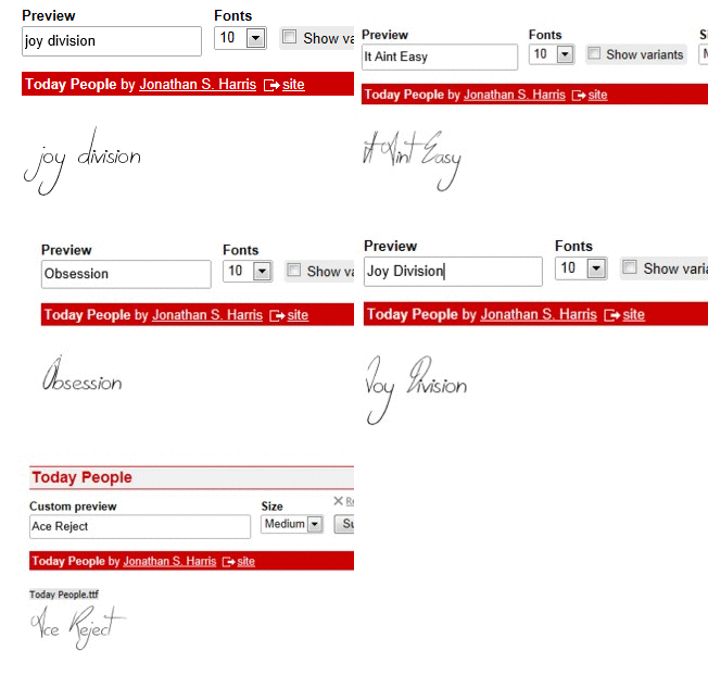
For the track list on the back panel, I used the songs from the Sugababes album 'Taller in More Ways'. I tested a few songs besides 'It Ain't Easy' to see how they look when they are written in the font I had chosen, and I found that the song 'Joy Division' looked better on my front cover layout, so I decided that would be my album name. I chose not to use capital letters, as this was the version that looked better.
In addition, the font I chose for the album title, called Today People, did not include symbols for punctuation, so I would have had to use a different font for the apostrophe in 'It Ain't Easy'.
I think 'Joy Division' works well with my cover because there is a division in the cover, done through the triangle shapes dividing the canvas, so it makes more sense and looks better than 'It Ain't Easy'.
For the track list on the back panel, I used the songs from the Sugababes album 'Taller in More Ways'. I tested a few songs besides 'It Ain't Easy' to see how they look when they are written in the font I had chosen, and I found that the song 'Joy Division' looked better on my front cover layout, so I decided that would be my album name. I chose not to use capital letters, as this was the version that looked better.
In addition, the font I chose for the album title, called Today People, did not include symbols for punctuation, so I would have had to use a different font for the apostrophe in 'It Ain't Easy'.
I think 'Joy Division' works well with my cover because there is a division in the cover, done through the triangle shapes dividing the canvas, so it makes more sense and looks better than 'It Ain't Easy'.
Wednesday, 25 December 2013
Final Video
Merry christmas, folks! As a surprise we've decided to to upload our final piece onto Blogger. Enjoy it and don't forget to leave us a comment below - peace
Thursday, 19 December 2013
ANCILLARY WORK: Fonts for Digipak/Advertisement
I have decided to use two fonts for all my ancillary work, and tried to find two that work well together, but that are also not similar to each other.
I looked online on website that offer free fonts, like dafont, and found one that I liked, called TodayPeople:

I am also using the font Trajan Pro, which I found already installed on the computers:

I looked online on website that offer free fonts, like dafont, and found one that I liked, called TodayPeople:
I installed this font on Mac computers using FontBook, which made the font usable with any software that is installed on the Mac, including Photoshop.
I am also using the font Trajan Pro, which I found already installed on the computers:
Wednesday, 18 December 2013
ANCILLARY WORK: Shortlist of Colours for Digipak/Advertisement
I have decided on the colours I will be using for my ancillary work. The background will be dark red, combined with black shapes (including the CD on the inside), and the text will be a combination of very pale pink, which looks very close to white, and bright red.
Here are the colours:
Here are the colours:
 |
| background shapes text(1) text (2) |
Monday, 16 December 2013
ANCILLARY WORK: Shortlist of Photos to be Used
I have created a Photobucket album (link) of the photos I am most likely to use on my ancillary work.
Here is a screenshot of the album on Photobucket, as the embed feature doesn't seem to work on Blogger:

Here is a screenshot of the album on Photobucket, as the embed feature doesn't seem to work on Blogger:
Sunday, 15 December 2013
ANCILLARY WORK: Things to Include in the Advertisement
Here are the things that should be included/used in the advertisement, in order to make it look professional and appealing:
- group and album name
- same fonts and colour scheme as digipak
- digipak front cover
- logos: iTunes, HMV, social media
- release date
- tour/concert dates
- graphics

- group and album name
- same fonts and colour scheme as digipak
- digipak front cover
- logos: iTunes, HMV, social media
- release date
- tour/concert dates
- graphics
ANCILLARY WORK: Things to Include in the Digipak (Front/Back and Inside)
Here are some elements that I need to make sure I include in my digipak:
Front:
- artist image
- album title
- artist name - bigger font than album title
Back:
- track list
- copyright information
- record company
- barcode
- web addresses
Spine:
- album title
- artist name
- cd number
Inside:
- CD shape on right panel
Front:
- artist image
- album title
- artist name - bigger font than album title
Back:
- track list
- copyright information
- record company
- barcode
- web addresses
Spine:
- album title
- artist name
- cd number
Inside:
- CD shape on right panel
Saturday, 14 December 2013
ANCILLARY WORK: Costume for the Photoshoot - Synergy
Our group had a photoshoot in the green screen room in the college.
We decided to create some synergy with the music video through our costumes - keeping the black/white theme for the clothes and having bright jewellery on.
These are the clothes I wore for the photos:


We decided to create some synergy with the music video through our costumes - keeping the black/white theme for the clothes and having bright jewellery on.
These are the clothes I wore for the photos:
Friday, 13 December 2013
ANCILLARY WORK - RESEARCH: Do's and Don't's for Digipak/Advertisement
Prezi illustrating what should and should not be done in our ancillary work:
Thursday, 12 December 2013
Photoshoot!


We planned a photoshoot in order to have material for our ancillary work. We chose different costumes from the music video, but they are based on the same style: black and white clothes and big accessories.
We took the pictures in front of the green screen/black curtain, which will make it easier for us to replace the backgrounds with other colours or images. Each member of our group will decide on a number of photos to use in their digipak and advertisements.
Here is a Flickr Photostream of our photoshoot.
Subscribe to:
Posts (Atom)