What have you learned from your audience feedback?
Glogster explaining how audience feedback helped me make my products better:
(Full screen works best)
This video shows the reaction of our media class and teachers after watching our rough cut:
Audience feedback after the cinema screening:
Strengths: costumes, dancing, locations, song, cutting to the beat
Strengths: lighting, costumes, cut to the beat, performers looked energetic
Strengths: editing organised, costumes, walking at the start showed we were a group
Strengths: movement, locations, camera shots, variety
Cinema reactions
-
The reaction to our video being shown in the cinema was good, our peers
seemed excited by our video and they seemed to enjoy it - they even had
a few positive reactions during the video, which I was really happy
about. This video shows how the cinema audience (where everyone was part of our target audience) reacted to our video:
- After the screening, I asked a few people to give me some feedback -
most of the comments I got included the fact that the editing was good
and they liked that it was in time with the beat; they all mentioned the
costumes worn by the performers, in the black and white theme. Our
location also seemed to be successful, and it did not take the attention
from the performers, but still looked good.
- People also liked the way we synchronized our movements to the music
and with each other, and the shot of us walking at the start of the
video was also appreciated, as it showed that we were a group.
Ancillary Work
Mary - Teacher feedback on ancillary products
The feedback I got from my teacher Mary on my ancillary work was very good. She liked the graphics I used on the front cover and the fonts, and the fact that I used them in all of the products.
I included all the needed information and my performers are in the spotlight on the cover. I also followed the conventions and made the album name smaller than the artist name.
One thing that Mary noticed was that everything on the advertisement was written in capital letters - this is because the font I used, Trajan Pro, had only capital letters - using the caps lock would only change the letters by making them a little bit bigger - like the difference in the name 'CandiHearts', where the C and the H are in caps lock with this font.
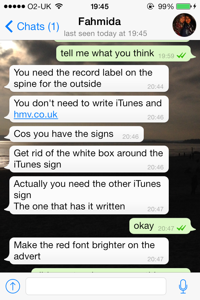
I have had some feedback on my ancillary work as I was getting close to finishing the digipak and advertisement. I asked my friend to give me her opinion on the social media app Whatsapp, and this helped me make some improvements:
She mentioned a few things that were missing, which I hadn't added yet as these were not the finished products. However, what she said about the iTunes and HMV signs really helped, as I decided to change those elements.
She also said that I should make the red font brighter on the advertisement. However, I did not change it because it only looked dark on our phones, as the image was very small. On the computers and in print, the red font was much more clear and there was no need to change it.
After I finished my ancillary work, I asked the same person to give me feedback on it.
I was very pleased with this feedback - I was sure that the costumes were very important to link this print work to my music video, as all the audience feedback I got before mentioned the use of our black and white costumes.


No comments:
Post a Comment