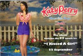
The advertisement photo and the digipak are set in the same place and the same fonts are used. the most important information on here is the release date of the album and a website but it doesn't have where this album is available.
It is easy to guess what genre the artists is. The colours, images and fonts used give it away. The artist name has a graffiti type font and there are are spray paint affects. There is a tower block in the background which means he is an urban artist. The same image from the album is used for this advertisement and the same fonts, so there are aspects of synergy. It tells you where the album is available and also a website is available but I think it's quite small.
The same image is used from the album on the advertisement, as well as, the fonts and colour scheme. Most of the relevant information is there except where the album is available.
The same image is used from the album on the advertisement, as well as, the fonts and colour scheme. Most of the relevant information is there except where the album is available.


No comments:
Post a Comment